Description
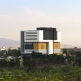
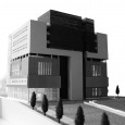
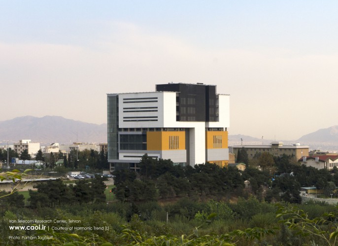
The main concern of this project is not just the common visual aspects of designing, but to manage strategically different topics that guide and adjust the architecture of the building. Programmed compounds have created a pragmatic ideal architecture in this project, and this pragmatism has integrated simple volumes with form-oriented ideas. Choosing and developing a method to reach the final plan and the proposed program according to employer needs and requirements of the project was so flexible that it wasn’t necessary for our group to ignore any of our ideas to execute the project. The way that this project was dealt with is going to be one of the major solutions to the upcoming projects that have the same characteristics.
- The idea of organizing spaces
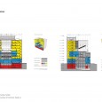
Initially, when our team was entitled to this project, the building’s foundation had been already set up. As a result, the coordination of the beams and pillars were already determined. Since reducing the cost and saving time plays a key role in this project; the network of the beams and pillars were accepted and considered as the context, which helped to take advantage of such limitations (although a lot of limitations were caused due to the distances between the pillars). The proposed approach defined a new spatial structure which left the architecture of the project unaffected. The necessary spaces in this building, according to the employer's needs and with the aim of changing lives, are divided into four categories:
- Public Areas: Administrative, Auditorium, Library, Training Classes, Gym, Pool, Sauna & Jacuzzi
- Specialized Area: Institutes
- Movement and Circulation Areas: Hallways and lobby of floors, The lobby of main entrance to the building, Stairs (Main and Emergency)
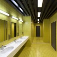
- Support Services Areas: Utilities, Elevators, Toilets, Pantries, Prayer halls.
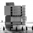
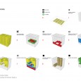
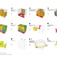
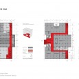
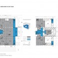
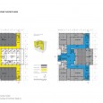
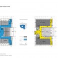
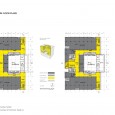
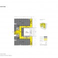
In this structure, some loops have been developed as movement and circulation areas; so all other spaces of the project were organized by them. Form and the structure of loops of each part were defined by the plan and application of that part or floor of the building. In fact, the project was created from two elements of “box” and “loop.” At first, loops with the nature of accessibility and circulation (vertically or horizontally), were placed to control the limitations of the structure, since the restraints of our structure has caused lack of integrity of spaces and lack of proper internal access. Due to the great number and remarkable size of expansion joints, they were one of the main factors of separating boxes within the building. Covering the boxes was avoided inside the building in most of the places to intensify this matter.
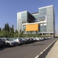
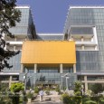
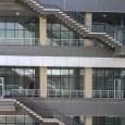
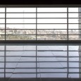
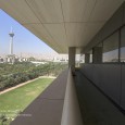
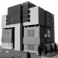
Due to the location and environmental conditions of the building, its view from north to the river of Kan’s valley and Darakeh, from west to the Goftegoo Park, from east to the green landscape of the center and from south to the landscape and garden of dormitory of Tehran University were considered as the main characteristics of this building which was ignored by employers due to its applicability. The reason is that the condition was considered as a closed box. But with insisting on highlighting them, we turned it to a feature of the project. All the created gaps as terraces or extensions of corridors and the balance of windows were adjusted with a strong potential. Terraces in this project as gaps, are inflection and linking points of different boxes which are subordinate to those spaces. On the other hand, they are there is a link between the building and its surrounding land and also the city which are glaring as grooves in the whole view of the building. To provide those people who are inside the buildings with the sight of the landscape of surroundings, two parallel strips were considered as windows.
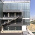
On the western side, louver windows with low width were considered that control the amount of light and maintain the proper sight for users. In order to create a space in accordance with human needs along with business needs, a terrace was created on the eastern side of the building, which has an overlook to the lush landscaping of the center, and specific floors were associated with them by longitudinal terraces. Moreover, some external stairs from the walls of the courtyard can have access to this courtyard and there are 4 bridges with 1-meter width which are extracted toward the area and is a place for employees to rest and relax. Harmonic Trend [L] evaluated different topics of the project with two approaches of Zoom in (Issues of applicability and building’s condition and their evolution with the presence of human) and Zoom out (Urban issues and surroundings and their evolution due to human’s presence) due to its work procedure.
The most important feature of this performance was providing ideas during the whole designing and construction phase of the project to minimize costs. Otherwise, little attention to the issue might halt the project. In order to prevent the construction of an additional building which costs much in its architectural and mechanical design and electrical installations, integrating various spaces, and creating multiple voids with different causes and issues played a key role in minimizing the cost.
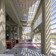
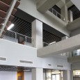
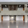
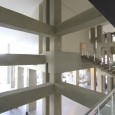
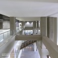
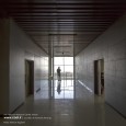
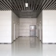
Due to the high density of beams and pillars of the concrete structure of project, it was decided not to cover them; subsequently it was figured that it is possible to polish them in order to make them visible. Moreover, this decision (except for covering beams and pillars), lead to this opportunity to save money and it was when the internal voids of the building were determined. In places where it seems surfaces are more than the actual need of employer, surfaces were considered as voids but in accordance with the application of floors. On the other hand, by creating internal gaps, the project turned into a box with a flow as if all people in different floors were in touch with each other. Ultimately, implementing these two options saved up to 30 billion Rials (approximately 3 billion dollars) in executive cost of the project.
Besides what is already mentioned, it is noticeable that two parallel strips of windows lowered the usage of glass. On the contrary, if it were a one-piece surface, the cost would increase exponentially. With such an approach not only the view was maintained to the surroundings, but also the costs were lowered enough to reduce waste of energy considerably.
- A change in the Lifestyle of this center
In other centers same to this center, people tend to sit for a long time on their seat according to their habit and their common life. With some considerations, encouraging people to move is one of the major goals, because human’s body is not compatible with sitting for long hours. As a result, the lifestyle of this center should be changed. Apart from accessibility, the paths create attractive and diverse spaces in terms of view.
While the paths are along with each other and in conjunction, they can be separated due to people’s decision and each path reach the destination with a different spatial quality. On that path, there are hanging external stairs or different voids overlooking the lush landscape and Alborz mountain range, and ultimately people can enter the east yard (big terrace) and stay there.
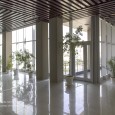
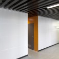
The material distribution inside and outside of the building has always been integrated based on the main idea and in accordance with boxes and loops. Outside the building, based on terraces and inside the building based on corridors and gaps, some spaces between boxes and between boxes and loops have been created as well to alter materials. The main materials used in the building are Glass, Metal Panels and Composite Metal Panels, Composite Wood Panels and different types of ceramics.
