Description
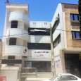
The four storey building was an old fast food take away, located in one of the famous streets, Niyayesh blv., in Shiraz. After our clients rented this building they wanted us to design and renovate the building, In order to have a food complex which serves varieties of food from Persian to Italian. Although our obstacles in this project was time, and budget (due to the renting condition) by Considering its great location, and the need for such a complex in the area we tried to use all its potentials to enhance the quality of the building and creating an attractive and friendly space for all the people with different tastes to get together and enjoy different kinds of food.
We chose the name Vardaneh (rolling pin) for this restaurant, to emphasize the use of the rolling pin which was used by our ancestors in the kitchen to shape and flatten dough which is a common tool in preparing dough in all the floors in this restaurant, and also try to tell the costumers that all the dough of bread and cakes here are handmade by our talented chefs.
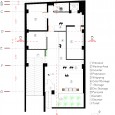
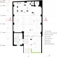
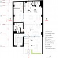
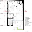
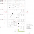
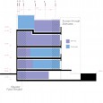
By evaluating the main access, the staircase and the elevators and studying each zones and each floors and the connection between them, we came up with this categorizing:
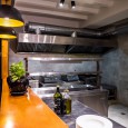
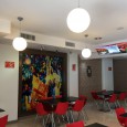
The ground floor was selected as a pizzeria, the first floor is used to serve pasta and burgers, and the second floor is used as the main kitchen, which can give service easily through the elevator and the food elevator to all the other floors as well as an easy access of the ventilation to the roof. We used the vacant parking (which was used as a storage before) as a take away, and also designed the rooftop as a coffee shop.
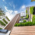
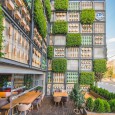
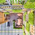
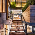
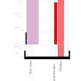
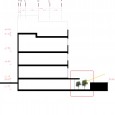
To enhance the quality space in the basement we demolished and changed the arrangements of the entrance stairs and built a suspended wooden deck which not only maximizes the entrance surface which gives us a bigger space for dining area outside the restaurant, also gives us a small garden below the deck which is used as a filter and improves the value and the character of the interior of the basement. It also allows the sunlight to penetrate through the garden below the deck and the space and bring life to it.
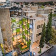
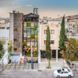
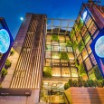
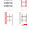
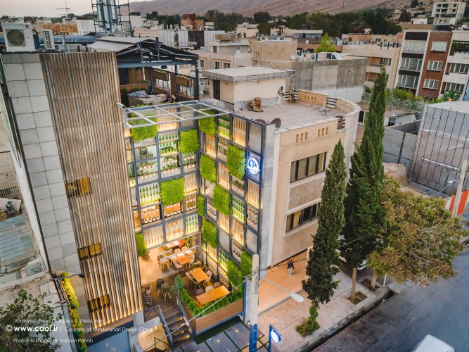
After analyzing all the aspects of the building, and studying the pros and cons, we came with the idea of uniting all the faces of the facades in to a whole existence and also trying to give a unique personality to each individual floor by its own. The renovation started about a year ago and took 6 months to accomplish. The old facade was made of stone and a curved "Alubond" to overcome the simplicity of the elevation. The first step was to demolish the "Alubond" and bring out the main surface. Since the building was rental we tried to use the original structure and enhance the original ventilation.
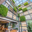
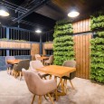
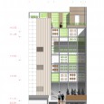
For uniting the facade our concept was the idea of the Persian gardens. Since we had no courtyard in front of the building we thought of bringing these gardens in the elevation and the interior of this project. Also the fact of clarity & honesty was our main intention in designing this project, therefore you could see all kinds of details and tools which are used in all parts of this restaurant in the elevation. You can interoperate it as a book which tells all the story of the inside to the people outside. Loud and clear. We also used this factor in designing the roof garden which is a delightful place with a view to the nearest mountain.
The traditional Persian gardens are famous throughout the world for their geometric layout and the divine concept of bringing heaven into the earth. A paradise you can call. The gardens purpose was and is to provide a place for protected relaxation which in our case we used this concept to give a harmony and peace in to this multi-functional restaurant and bring life to its flat surface and create a place where people can appreciate its energy and peace.
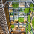
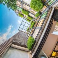
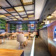
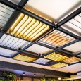
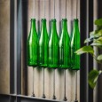
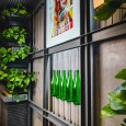
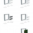
For designing the main elevation we used a geometric square grids made of metal framed channel beams which is inspired by the geometric designs of the Persian gardens which is filled with different details from greenery to rolling pins, pizza and bread pans to recycled bottles. This main grid was used as a frame throughout the project from the walls to the ceilings, in the exterior and the interior to build a structure to create a unity for the spaces and its details.
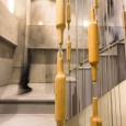
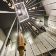
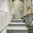
There are 5 staircases in this project. One which is the access to the takeaway in the basement, the other is the main entrance of the restaurant, which is designed with a deck, a smaller one which is from the ground floor to the main staircase in the left of the facade. And the main staircase which is the main access to the first, and the roof garden. And a small one on the roof for the VIP lounge. There is an elevator in each floor which is only used by the staff for the service. Therefore the customers have to use the stairs to get from the first floor to the roof garden (coffee shop). In this case we designed a series of wired rope with a decoration of rolling pins, in the center of the staircase to emphasize the continuity and rhythm to the stillness of the staircase and make the space attractive for the customers in order to get to the upper floors.
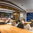
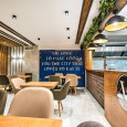
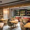
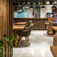
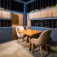
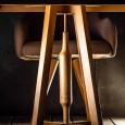
The materials used in this project are mostly environmental friendly. wood and greens, and even recycled bottles. In Vardaneh we even designed the furniture to bring harmony and unity to the design.
