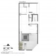
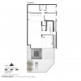
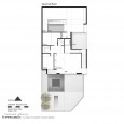
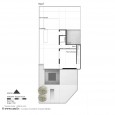
Description
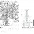
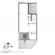
This project includes three-unit house design on Hezarjrib street in Isfahan. As a site plan is located on HezarJirib Garden, which was designed according to the network layout design and is considered as historical structure of Esfahan, it regarded as the main or core idea of design. The network design layout that is characterized by a specified order and distinct alphabet for the reproduction and production of places, is repeated from part to the whole and creates the cohesion, continuity and total unity in the city and historical structure. In order to address an architecture in a city, at first step, you should identify its culture, history and social conditions that make up the dimensions of the main outline and the basis of the design idea of the building which by itself causes that the design merges with its domain and creates spatial sequence and continuity in the urban context.
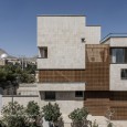
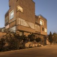
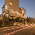
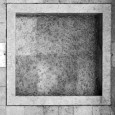
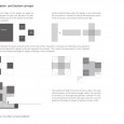
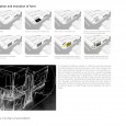
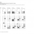
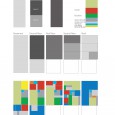
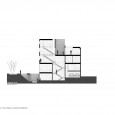
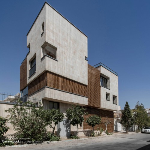
In designing the main volume of this project, each cube is a residential unit. The geometry of the building is designed based on the geometric order of the historical structure of Isfahan and the square modulus. Space has been created from a variety of units that may be distinguished from the base module and square geometry and this modulus creates a variety of spaces via integrating, aggregating and varying the scale which have been multiplied with specific proportions in space as in the east, the square is a perfect, balanced form of persistent characteristics and it may be repeatedly reproduced in its nature. Hence, we tried to use the fixed patterns, geometric systems, proportions of the historical structure, and the principles of designing from the part to whole, and we reach diversity only by changing the scale, protrusion, diminishing the volume and shadowing along with the least degree of deconstruction and inconsistency. Unity may be developed relying on 3 principles of Iranian architecture that are geometry, weight and brightness.
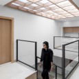
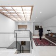
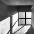
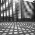
Therefore, the regularity and uniformity of the forms, from part to the whole, is not identical and repeated, and bear the dynamic and infinite unity. The materials were used according to urban regulations and climatic conditions; the brick was selected for the main volumes, which, in terms of dimensions and standard, helps to boost the work order. Wooden grids were used to cover the empty parts between the volumes and their connections in a sense that by using the traditional Chinese knot pattern and grid geometry, we would help reduce direct sunlight and in this respect rectangular geometry and network system may be repeated. This wooden network is latched in two directions i.e. vertically and horizontally which by regular arrangement aggravates the continuity between volumes and through creating light and shadow on the inner surfaces, it provides a better look.
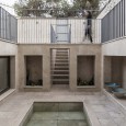
The warp and woo of the wood is tied in a way that it looks as an imaginative net around the building and surrounds the building which connects the rigid volume and the units in a transparent manner. Therefore, the materials were chosen with respect to their function, philosophy and meaning of each form, and this is the Iranian geometry that in addition to the symbolic aspect of the light in moving circulation, it plays an important role when using at the ceilings and on the walls in rectangular modulus. Decorative elements are also abstract and are based on the general geometry and design idea (network layout). Also based on the climatic arrangements, the traditional components of sustainable design, such as wind catcher layout, terrace, sunken courtyard and pond and plant were used.
Farsi
Please click on the Link below to read the information in Farsi Language.
Click Here!

