Description
Building as a single element of the city has an inevitable influence on its urban surrounding. During the design process, it is crucial to consider this mutual effect to create a win-win relationship between the building and the city. Our approach to each of our projects have somehow been in line with this criterion. In Kohan Ceram project, our mission was to have minimum formal disturbance to the city. In this project, however, form was the key to realizing the essence of the project. Here, the formal elements were used in both the overall entity and the individual parts.
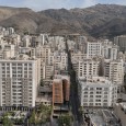
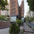
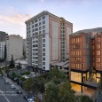
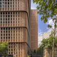
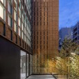
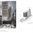
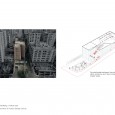
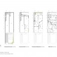
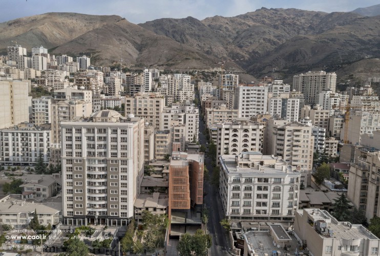
Hitra Commercial-Office Building is located at the sloped intersection of two main streets in Velenjak neighborhood of Tehran. There is a 15% elevation difference throughout the site of this project. Above ground floors of the building are dedicated to office units. The commercial zone and the entrances were arranged to create outdoor green patios for people to relax. These platforms are aligned with street levels on both sides of the building to create an urban plaza for the public.
Opposing the common urban development in the city, were most buildings are designed based on personal benefits, this project tries to create a win-win opportunity for both the commercial units and the city by creating a public space for the neighborhood which is highly needed in a city like Tehran. These small public platforms transform Tehran neighborhoods into more dynamic spaces in which commercial zones have more connection to the surrounding urban areas. The main criteria of this project was to reevaluate the morphology of a typical office building to improve the quality of natural lighting and view without altering the optimum built area of the building.
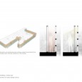
The standard regulation for office buildings in Tehran indicates that the occupation area of the building should not exceed 60% of the land area + 2m. Following this rule, usually a portion of the land area would be used as a central light well, to provide light to the central units. Moreover, the allowable proportion of glass to other materials used on the façade is 40%. These two regulations were reassessed during the preliminary investigations of this project in order to optimize natural lighting and view. Another criteria was to create an integrated system for the commercial and office zones.
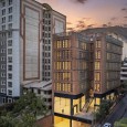
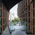
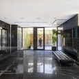
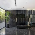
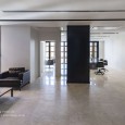
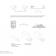
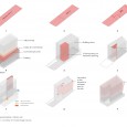
The primary volume of the project was formed by relocating the interior void to the surface. This void not only forms the main entrance, but also provides light and view to the central units. This new morphology increases the surface area of the building in contact with the city and connects people to the office zone through the created welcoming entrance. Following the existing slope of the site, the commercial zone of the project was formed in three levels. There are two entrances (North and South) to the office section both of which connected to the administrative lobby of the complex.
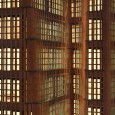
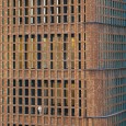
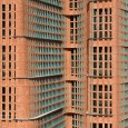
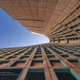
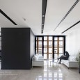
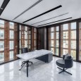
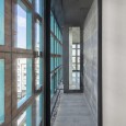
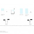
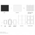
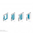
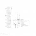
As mentioned before, two of the main considerations were to create an integrated volume and to reevaluate the 40% glass use on the façade. Moreover, it was important to avoid forms which cause disruption in the city. Considering all the above criteria, an integrated double skin façade was created with the outer porous skin formed by brick and torques metal frames. The combination of brick and metal frames formed modules which enable bigger openings on the façade. Based on this idea, a homogeneous mass was formed which creates a varying combination of brick and turquoise colors for the viewers based on their location and viewing angle. Size of the frames vary based on their location on the façade. Moreover, the continuous glass windows on the inner layer of the double skin allow for proper sunlight penetration to the office units, reducing the electricity consumption throughout the building. These opening provide access to the outer shell of the building.
Farsi
Please click on the Link below to read the information in Farsi Language.
Click Here!
