Description
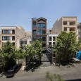
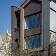
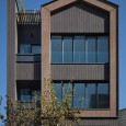
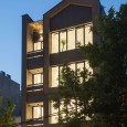
The client’s demands, safe and cozy home that reminds him of childhood memories, which leads the architect to use the basic shape of a home for a child. If one asks a child to draw a home, one can expect a house with a square and triangle on the top, although the architecture of the child’s imagination is detached from the expectation of urban architecture. Consequently, the architect uses line and fracture to create flow and emphasis to develop a unique and memorable project with architectural principles for the client.
“The design process is based on a constant interplay of feeling and reason” Peter Zumthor
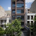
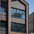
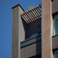
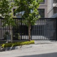
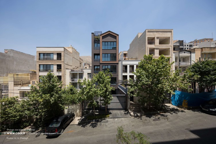
Finding a solution for the client’s request, by paying attention to the municipality construction rules of using bricks, leads the architect to present a new design of brick panels by using a fresh pair of eyes to look into the project. Designing the special pattern of bricks to add a wood accent to bring the house-in-house form to life and make it conspicuous in the dark-colored brick facade context.
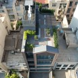
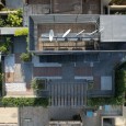
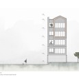
The old buildings near the site location and their development potential, limit design options and it’s the reason why the material selection is an important factor for the architect to create impactful design in the area. Adding the shape of the house to the top of the building, makes the observers look up, and planting a shrub close to it, brings the project to life.
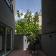
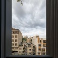
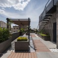
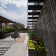
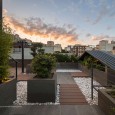
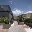
One excellent means of placing the house form at the top of the project is to plan for private outdoor spaces that allows the client to enjoy the city view, which also ensures that the space is shielded from prying eyes. The architect shows that even in a high-density (urban infill) location, it’s possible to create a sense of privacy.
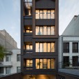
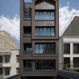
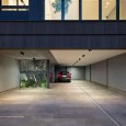
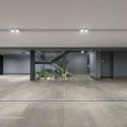
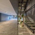
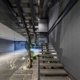
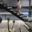
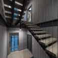
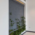
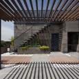
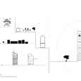
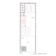
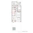
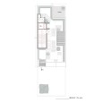
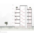
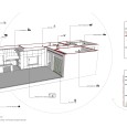
Building four levels with a single unit per floor is because of the narrow lot and client demands. The architect uses exposed structures and transparent walls for common areas in the building, to make the most of the available space and make small spaces wider, and also provide parking space requirements. Moreover, visual balance and reducing noise are achieved by adding green space to the project and allowing users to connect to the space.
Nothing goes better together than nooks and books, the architect locates the reading nook near the hallway and kitchen, an isolating, comfy, and relaxing place, to curl up with a good book for a long and lazy afternoon. In conclusion, the project has been completed successfully with tight budgets and improving the construction quality in the region.
Farsi
Please click on the Link below to read the information in Farsi Language.
Click Here!
