Description
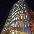
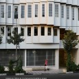
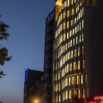
At the heart of one of the busiest zones of Karaj, Valiahdi Commercial Complex is located in a vehicular-pedestrian boulevard. Taking into account the high volume of pedestrians in the area, it was important for the design team to create a multidimensional facade which respects the observer from various angles and creates an intimate connection between the building and the city.
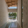
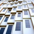
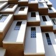
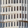
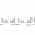
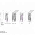
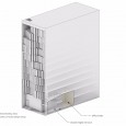
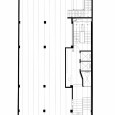
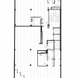
Inspired by the existing street network and urban context, a geometrical grid was created which was later modified to optimize the viewing angles. This geometry gradually transforms from negative to positive volumes at the top and bottom, creating two major voids at these sections. These voids then form the main entrance and the balconies on the top two floors. The new geometry was further developed to create a repetitive module defining both the exterior façade and the interior spaces. These modules also act as diaphragms, controlling south sunlight exposure.
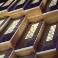
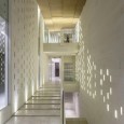
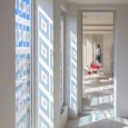
Multi dimensionality on the façade also creates a dynamic visual connection between the building, the city, and the observer, so that the perception of the observer varies while moving toward or against the building. This perception is also affected by the sunlight variations, resulting in a dynamic light and shadow pattern on the façade during the day. Inspired by Orosi from the traditional Persian architecture, stained glass was used to further develop the idea of the dynamic presence of light and shadow and to enhance the quality of the interior atmosphere. Moreover, this technique helped to control the heat generated by the excessive sun exposure on the south side by catching most of the generated heat. Vitray stains were used on the inner side of the two glazing layers making the system highly durable against external influences.
The two symbolic colors in the Traditional Persian Architecture are brick and turquoise. The ancient bazaar in Kashan is a great example where there is a gradual shift from brick in lower parts (representing earth) to turquoise up at the dome (representing sky). In this project the shift between the two colors was established based on the fluctuations on the façade. There is a more concentration of the brick color at the concave sections whereas a more concentration of the turquoise color at the convex sections. In some parts of the interior surfaces transparent and semi-transparent glasses were used parallel to the façade glazing. This allows most of the mid-spaces to have natural lighting during daytime.
Farsi
Please click on the Link below to read the information in Farsi Language.
Click Here!