Description
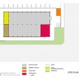
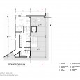
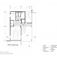
Panta Company's factory is located in Parand Industrial City,( southwest of Tehran), where many industrial buildings are in the form of duplicate niches with poorly designed architecture. The Panta Exhibition and Office Complex project was ordered to our office, after the structure was completed and the roof and wall sandwiched panels were installed. Initially, the project's employer wanted to build an office building near the factory's front door entrance to allow better visibility on arrival. At the same time, there was a showroom inside the factory and a set of toilets for workers inside the factory. The Panta Exhibition and Office Complex was planned to be approximately five hundered square meters with interconnections, administration room, conference room, office, financial, service areas, exhibition space and dining room.
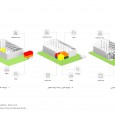
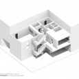
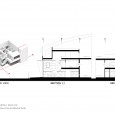
The occupancy rate of the main lounge was about 65% of the total terrain area and in site analysis due to the high height of the factory, the remaining floor space was not capable of creating a two or three storey office building and could result into a crowded space and Create a mess. Initially, the project's physical schedule was optimally suggested in meetings with the employer. Continuing this route, the architectural group passed on their opportunity to design a separate office building and suggested to , mix the demands of the client inside the main hall and decided to design an integrated, well-understood outdoor complex on the project site to complement the project. More economical and rational. Minimal occupation of land and the use of existing height also made it possible to be in two storeies for new spaces.
The design process of this complex began with this question that how the office space in an industrial site can be transformed into an index space that, while meeting the needs and performance of users, enables them to experience a different space in the industrial environment, while at the same time Extraversion itself, the visual appeal to the soulless building of production. Unsuccessful architectural experiences in industrial plants provide a further impetus for the design team to show that simple and explicit responses to the needs of users in such spaces can be provided.
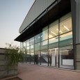
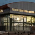
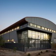
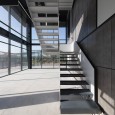
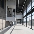
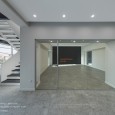
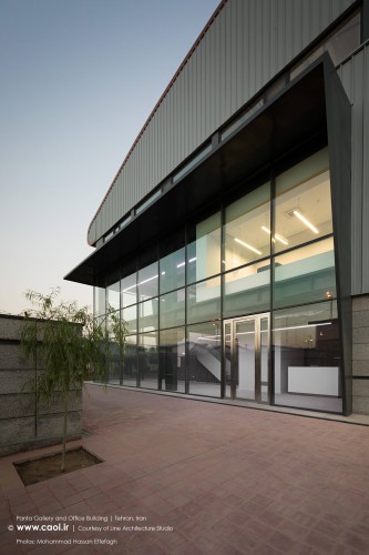
Since the factory is producing decorative electronic equipment, an exhibition inside the plant and next to the production line was foreseen. And due to the changes of the physical plan of the project by the architects and moving the exhibition space from the production building into the entrance and office complex, We found it possible to combine it with the lobby space to have a larger mass on the entrance, and by locating the walls of the space, removing the roof and thus doubling the height, locating it on the southeast corner To maximize the exterior effect. Applying a large glass surface to the wall helps to bring a different image of the entrance and exhibition space from the moment the site enters, creating a transparent space so that the building and site are intertwined. Along the way, a great deal of light penetrates deep into the spaces, and light is also given to indoor spaces that are inevitably deprived of natural light.
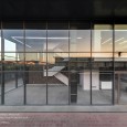
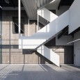
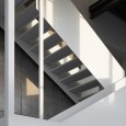
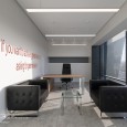
In the meantime, the design team decided to purify the interior spaces by displaying the the beauties of the structures and installations and omit the ornaments and unnecessary decorations. Since some part of the lobby will be dedicated to an exhibition space, the staircase is designed in a way to have a sculptural, abstract expression of the space type. By clearing the eastern and southern walls of this space and contrasting with the exterior appearance of the niches, we decided to frame this glass cube with metallic elements as dark shade. The most important office space of the complex is the management area, therefore it was located as a cube in the main view. Other office spaces and offices that are more in control of production line activities are located on the west side so that they can have a proper view to the production line by opening windows on their walls.
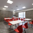
The use of neutral colors (black, white and gray) in the background, and sometimes the combination of colors into the elements and furniture of spaces, have been the design decisions of the interior. It will be easier for users over time. The design decisions and ideas for this collection have unconsciously influenced the design of the details of the site, including flooring, outer walls, and so on. Through this selection of red concrete mosaics, a variety of cool and uniform spaces are set. And by designing porous metal walls around the set, a good visual connection is made between inside and outside. Architectural design team has been looking for a simple, modern and industrial space statement to establish a bold presence in architectural design. In this way, attention to space transparency, fitting detail and and extravagance is a key word set. And it's been strategic.
