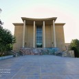
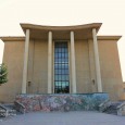
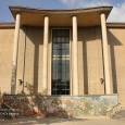
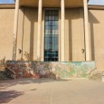
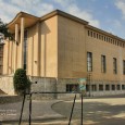
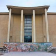
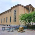
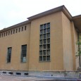
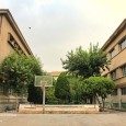
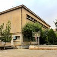
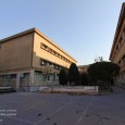
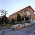
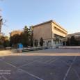
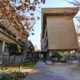
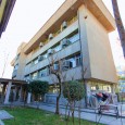
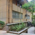
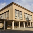
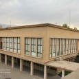
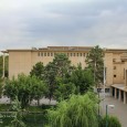
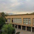
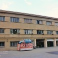
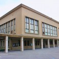
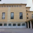
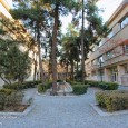
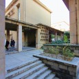
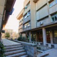
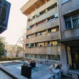
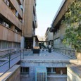
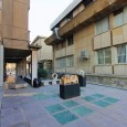
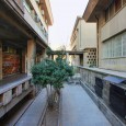
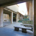
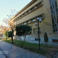
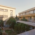
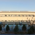
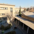
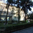
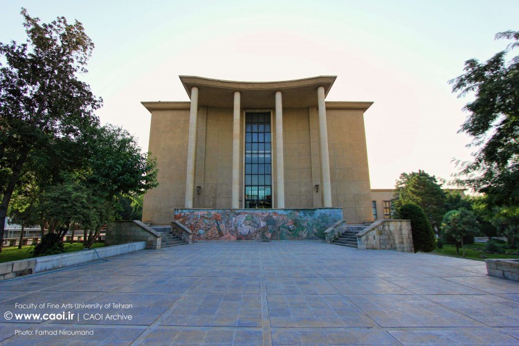
Description
With the approval of the Ministry of Culture and Art, School of Fine Arts, called "studio", was established in October 1940 at the place of Marvi High School. After September of 1941, workshops of the studio were moved to a basement in the Western Area of the Technical College building (on the campus of Tehran University) and attached to Tehran University with the name of "studio"; then, it was added to the Faculties of Tehran University with the name of "the Faculty of Fine Arts" under the law acted on April 18th, 1949. This faculty was moved to its current location in September 1849 with the operation of one of the workshops of the Faculty on the campus of Tehran University. Since then, other sectors including the architectural ateliers, the painting atelier, the sculpture workshop, the judgment and exhibition halls, theoretical classes, the administrative departments and amphitheater salon were gradually developed with the completion of the construction operations.
The last sector, namely the library and the classrooms of music and theater, was opened on December 21st, 1966. Until 2005, the Faculty of Fine Arts had five departments as follows:
- Department of Architecture
- Department of Urban Planning
- Department of Music
- Department of Visual Arts
- Department of Performing Arts
In 2005, with the changes of the Faculties of Tehran University into the campuses, the Faculty of Fine Arts became "the College of Fine Arts" and the above-mentioned departments turned into the "colleges".
The Position of Tehran University Complex in the Urban Fabric
Placement of the Complex in the Urban Fabric (Figure 1)
Position of the Complex on Site
Placement of the Complex on Site
As mentioned earlier, the arrangement of the Faculties of Tehran University on the site follows a path like ∩ , in which the Faculty of Fine Arts is located on the southeastern side. The College of Fine Arts is surrounded by the Faculty of Literature from the North, Ghods St. from the East, Enqelab St. from the South, and the area of performing the Friday Prayers and the green spaces from the West.
Geometry, Slope and Terrain of the Land
The College of Fine Arts has been constructed in a rectangular shape land with the approximate dimensions of 100×200 meter which its length is along the longitudinal axis of the university. The slope of the land is about three percent from North to South.
The Internal Communication Network (Roadway and Footpath) of the Complex
Due to the placement of this building on the university site and its surrounding open space, roadway and on foot accesses to a part of the communication network within the university. The main access has been designed on the west side adjacent to the U-shaped yard (Figure 2).
Until 2004, the U-shaped yard of the College of Fine Arts was a car parking area for professors and staffs. After that, the street adjacent to the campus was used for this purpose. Since the beginning of 2008, the vehicle arrival at Tehran University was banned.
General Principles Governing the Design of Green Space and Landscaping
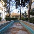
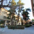
Green spaces of the campus consist of some courtyards which have been designed in order to make a distance between the building blocks to provide light, ventilation, and afford a panoramic view to the surrounding landscapes. The area of these courtyards is defined with the buildings and green elements (such as the trees). The central green space is located in a rectangular land with the dimension of 4×32 m at the main courtyard and its major role is to reduce the visual consistency of the construction masses. Only one of the green spaces has the waterfront and rest of them consist of a row of trees and shrubs.
The Architectural Design of the Complex
Skeletal Description of the Building
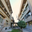
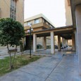
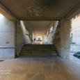
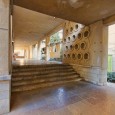
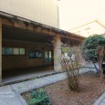
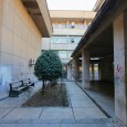
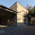
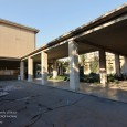
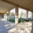
Campus of Fine Arts is composed of eight building blocks which generally consist of the rectangular cube volumes or a combination of them (Figures 2). These buildings are located around or between the courtyards. These buildings are also in contact with each other by a covered walkway extending along the longitudinal axis of the university. Due to the slope of the land, there are some level differences between the buildings which through designing some stairs in the communication corridor, in addition to providing access, its uniformity and length has also been reduced .
The three-floor building on the north side includes the architectural judgment hall, exhibition salon, the dining room of students and professors, the offices of the faculty members, and some other administrative offices. Amphitheater, classrooms of the theoretical courses, warehouses, the office of the head of campus, and administrative affairs are located in the central building adjacent to the main courtyard on the east side of the campus.
In the south-east, there is a two-floor library which also includes the theater groups; the sculpture workshops are located in the north. On the south side, a four-floor building has been allocated to the Department of Industrial Design and the relevant workshops. The architectural ateliers are located on the west side in the three volumes of rectangular cube, with two floors on the pilot. The orientation of these buildings is in such a way that most of their exposure to light is from the northern and southern fronts. Therefore, they have been developed along the east-west axis.
Space Organization of the Elements
Analyzing the Space Program of the Elements in the Complex
In order to investigate this issue, a concise understanding of the educational system of the architecture field in that time seems useful. In the early years of its foundation, the curriculum of the Faculty of Fine Arts had been based on the curriculum of the Buzar School in Paris, France; and its main focus was to design and render the architectural projects freely. In this approach, each atelier belonged to a professor. Students, including the beginners and novice ones to those who were at the end of their education, were registering and participating together in the ateliers. In this way, the lower-level students were in direct contact with the exercises and assignments of the higher-level students.
The professors were managing the ateliers alone or with their assistants. In this method, there is a tremendous need for the vast spaces to deploy and train the students from different levels of education. For instance, some of the architectural ateliers of the Fine Arts Campus are about 380 to 400 square meters in area. The outcome of a year or a semester of the students' education was a vast number of large-scale drawings, paintings, and maps which their assessment and delivery needed the large lateral spaces. Designing large spaces for the ateliers, judgment salons, visual arts workshops, libraries, auditoriums, etc., besides the classrooms for the theoretical courses and the administrative offices, had been among the main requirements for the design of this complex.
The main structure of the space organization is like a cluster in which the main corridor is considered as the backbone or an axis, and the buildings are like the branches which are located on the both sides asymmetrically and with different dimensions .In the plan of the complex, there are concepts such as the rhythm, hierarchy, axis plan, full and empty volumes, and symmetry and duplication of the elements. Formation of the elements along the corridor is considered a rhythm, and the layout of the elements shows their hierarchy. Among the construction volumes, wherever possible, the negative spaces have been proposed as the green spaces. Negative spaces have been used for defining and creating a different spirit into the positive spaces. In fact, positive spaces gain their usefulness, beauty, and diversity from the negative spaces.
Outstanding Elements and Techniques of the Complex
Style and Spirit Governing the Complex
Given that different parts of the complex have been gradually built over the years, there is a harmony between the building blocks within the College of Fine Arts and with other buildings existed on the site of Tehran Uuniversity. Purity of the volumes, classifying the operations, lack of ornament, geometric and modular structure of the plans, the concept of open plan, the simplicity of the fuselages and the vertical and horizontal proportions represent the effect of modern architecture movement and some trends in the design of the complex which put more emphasis on the functionalism in the architecture.
Type and Using Manner of the Dominant Building Materials in the Complex
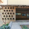
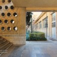
The structure of the buildings is of the reinforced concrete and a combination of the cement plasters and glass openings forms the original building materials of the facades. The complex has a desirable level of construction quality. Some construction details in the complex are among the most appropriate details available in the similar buildings. The details of the installation of windows, implementation of the canopies and sun breaker blades are among the most important implementation details about the buildings of this complex.
Analysis and Evaluation of the Façades
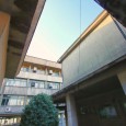
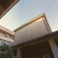
Due to the combination of a variety of volumes in this complex, there is no main and dominant façade; thus, some common principles are expressed in the design of the facades. A combination of the straight lines with an emphasis on the vertical proportions forms the main façade of the blocks. The rows of the windows have created a visual balance with their repetition in the form of a horizontal bar. Withdrawal of the windows and the existence of some functional elements such as the canopies and sun breaker blades, in addition to the creation of diversity and penumbra at the wide levels, emphasize the style of building. Placement of the three blocks B, D, and C on the pilot and the extension of the Campus of Fine Arts along the north-south axis along with the green spaces have created diversity and different visual views .The deep and continuous shadow created around the communication corridor puts more emphasis on its privileged role as the communication joint. As mentioned earlier, at the western end of the block A and on a stone platform created due to the slope of the land, the design of an entrance to the exhibition plays a key role in linking the College of Fine Arts with the Campus.
