Description
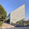
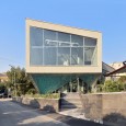
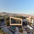
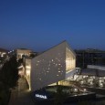
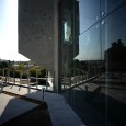
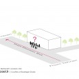
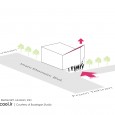
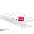
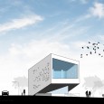
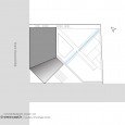
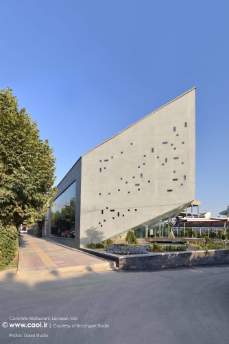
In this project, we faced a challenge to get released from the past conceptual frameworks and experiences. We not only tried to make the building memorable, but also struggled to persuade the users to explore the whole project. We had a clear purpose: Designing a restaurant beside the main boulevard with a limited budget. The initial site analysis resulted in the rotation idea in the north east corner, as a re-action to the traffic in the Main Boulevard and consequently creating the main entrance for the building. We consciously guide the users from Main Boulevard to the alley and lead them towards the project’s entrance. In fact, we force them to move around the project and explore it. In other words, the entrance was formed under the cantilever.
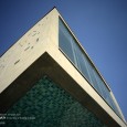
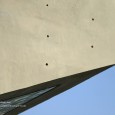
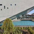
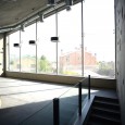
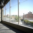
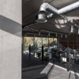
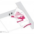
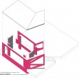
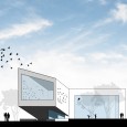
In order to emphasize the entrance and creating a different and influential meaning for it, this part was separated from the ground and cantilevered. During the design process, we tried to embed architecture in structure. Exposed structural and mechanical elements was used to form the whole building. One of the objectives in this project was to highlight the key role of the structure. Regarding the limited budget, expensive and redundant materials were excluded in the design process.
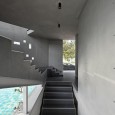
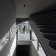
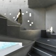
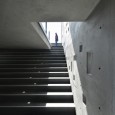
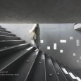
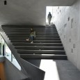
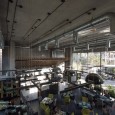
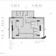
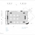
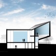
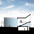
Making such decisions is complicated. Some issues such as limited budget and lack of technological experiences, made the process more difficult for us. Although the project is not completely flawless in the construction, but the conclusion illustrated our idea well enough. This project is designed in three levels. First basement is assigned to servicing activities such as kitchen, staff room and rest room. Ground floor and the mezzanine are the main salons. We have tried to design the circulation path as a unique space which not only plays a key role in connecting the main parts together, but also creates a unique experience for the users.
Farsi
Please click on the Link below to read the inforamtion in Farsi Language.
Click Here!
