Description
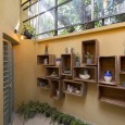
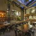
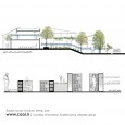
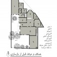
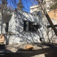
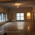
Project subject: Design and implementation of the architecture, interior architecture, solidification and landscaping of an old building with a history of 80 years on a land of 700 square meters with a total area of 1000 square meters. Todays, a lot of modern spaces are established showing the superior technology of the present century and are awesome but in this project, we created a hangout to spend time slowly and quietly by the sound of flowing water and the sound of leaves.
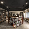
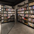
The numerous employers’ demands for reaching the requested programs, the limited time for design and implementation, the upcoming cold season, and the specific budget from the employer challenged us to suddenly planning, creativity, equipment, and start-up. The theme was fascinating, the achievement of combining a cultural space with the approach of creating green and natural space, along with the provision of artistic and musical products, the creation of a lovely-scale intimate atmosphere, the use of simple and familiar materials along with the design of modern plant systems and structures was a multi-stage process that was implemented in the short term in all stages of the project with simultaneous overviews. Our spatial organization in the design was based on functional spatial hierarchy and attention to the identity of each corner of the building.
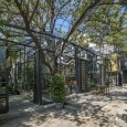
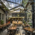
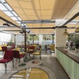
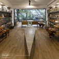
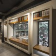
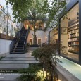
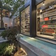
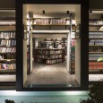
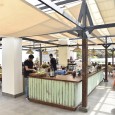
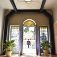
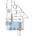
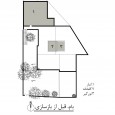
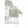
Firstly, the entrance as a substructure with a special flooring design, a semi-closed ceiling, an angled entrance to the greenhouse cafe, a pause and a gathering location at the entrance of the guests in combination with the green space next to the fountain and the transparency of the extension wall of the bookshop was a motivation to continue the path to the second stop yard (square).
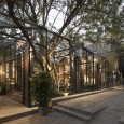
The second court was a place for conversation, pause, setting up the specific plans and selecting a route and the existence of an old maple tree at the center of the yard was used to create a specific node point. The access to the complex from this square yard to the entrance hall and multi-purpose gallery was designed individually allowing the internal circulation of the collection.
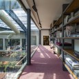
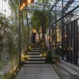
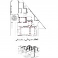
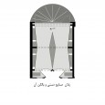
Selecting the location of the staircase, the size of the space in front of the handicraft space and the aisle reaching the roof restaurant were predicted with the idea of moving and pausing freely and creating attractive view axes in the plan. Accordingly, the ceilings and walls were adjusted. Open and closed partitions and open view perspectives in the semi-open roof space were designed based on the green space landscape of yards and Niavaran Street to create an attractive atmosphere for all seasons.
The approaches selected by the consultant:
- Paying attention to the tolerance of old building in new loading (strengthening the old building)
- Combing the physical program with architecture pattern of the original building
- Separated circulation in the service and public sector of the project
- Implementing the electrical equipment as floor and mechanical as exposure and avoiding the destruction of walls.
- The importance of the pause points and required visual/motor axes for creating the attractiveness of space circulation
- Using the familiar and existing materials in the area
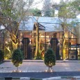
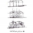
- Using the volumetric pattern of gable roofs for the emergence of new greenhouse ceilings in combination with the existing trees
- Designing the Portable furniture with variable pattern based on rental properties
- Maintaining the closets and wall ovens behind the new panels
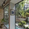
- Using the primary brick walls in a decorative way
- Preserving the old home decor (gypsum, colored glass, old doors)
Farsi
Please click on the Link below to read the information in Farsi Language.
Click Here!
