Description
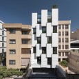
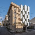
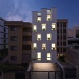
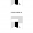
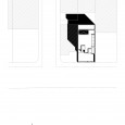
The boundary of the adjacent buildings is such that in its western side, according to the city laws and regulations, the building has a 45-degree fillet, and the front of the building on the east, is 10 meters behind, due to the expansion of its land with a twice in length. It is only south facade of the project that allows in, natural light and provides urban views.
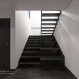
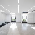
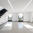
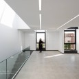
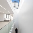
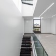
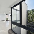
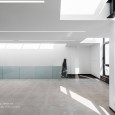
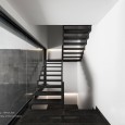
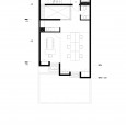
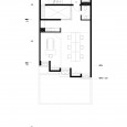
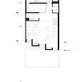
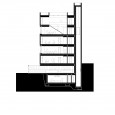
The user is a creative firm who spends long hours at work, therefore, besides management zones, workstations, meeting and brainstorming areas, there is a need for rest and recreation space in the building. The Vertical access is located at the northern end of the project. With the placement of a void stretched along East-West, natural light was provided in the staircase as well as the northern front of the office. Also, the addition of a vertical green wall inside the void, brings freshness into the work environment.
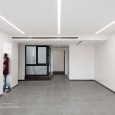
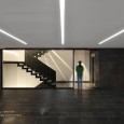
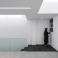
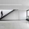
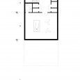
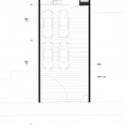
The vertical distribution of programs is in a way that the management rooms are on the upper floors, the work stations and brain storming rooms are in the middle floors, parking on the ground floor and the rest and recreational areas are laid down in the basement floor. Considering the small width of the plot, in order to increase the efficiency of the space and create flexibility in interior’s layout, most of the enclosed areas such as server rooms, filing shelves and bookshelves were packed in the solid boxes on the south facade.
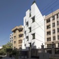
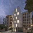
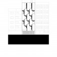
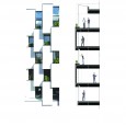
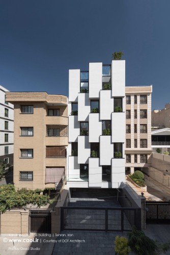
In response to the neighbor’s 45 degree fillet edge and considering the building’s front border set by regulations, the south façade was formed by a rhythmic pattern which is the result of playing with solid masses and windows. As a result, there are set backs on the façade which form flower boxes on the urban face of the building and add freshness both from inside and outside. Also displaced boxes on façade cause dance of shadows in different hours of the day and result in having a dynamic urban face.
There is a 10 meter difference between the front border of this building and its eastern neighbor which results in having a blank façade on the east. To meet the city laws and regulations of using white cement on side fire walls and in order to create a three dimensional building mass, the south façade was also covered with white cement. Risk of cracks appearing on the cement façade was reduced dramatically by adding additives to the cement and also dividing large areas by U steel profiles.
Use of double layer of anti-static material on the cement, reduces absorption efficiency of the cement and also prevents the façade from absorbing dirt in a polluted city like Tehran. In order to create a unique pattern, a special comb was used on final rendering which created a linear horizontal pattern on the façade.
The green wall in the void and flower boxes on the south façade are equipped with automatic watering system, and have easy accessibility for maintenance and they use the grey water of the building. All efforts by design team was to create a dynamic work place to produce creativity in the work environment.
Farsi
Please click on the Link below to read the information in Farsi Language.
Click Here!
