Description
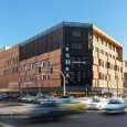
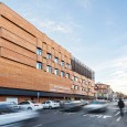
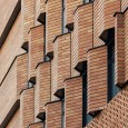
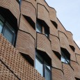
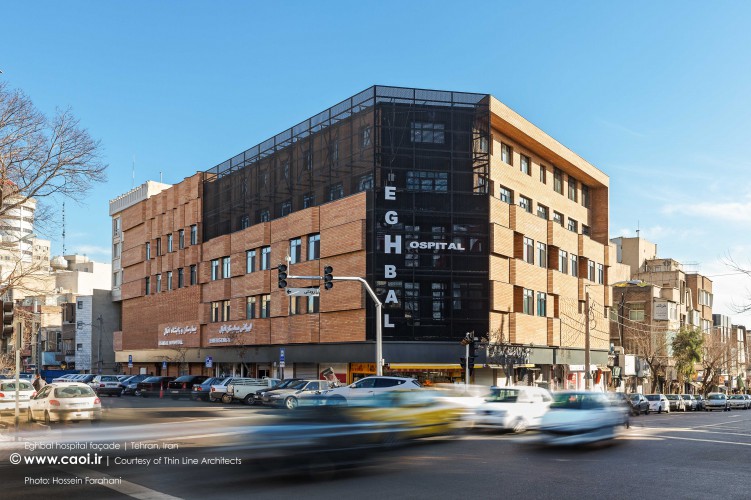
- The refractory façade brick was our choice as the main material considering that it was the commonest material in that neighborhood since long time ago and it is practically appropriate for the climate of the region.
- The undeliverable installations led us to the conclusion that our design should be fully flexible.
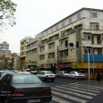
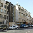
- We made a point of not worsening the disorganization and disorder of that crowded conjunction, as our main concern.
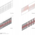
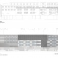
That was why we limited the number of materials and colors to an almost minimum. We also tried to simplify the elevation by devising a grid that was mostly affected by the layout of the windows.
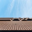
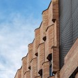
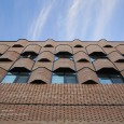
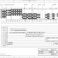
- The concept then turned on some waving brick band pattern that follows the grid direction and blends in pleasantly with the windows array.
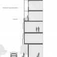
- The balcony on the 3rd level had to be covered in a way that would let light and wind pass through but limit the view so that the ventilation equipment wouldn’t clash with the elevation.
That was why we went for a kind of expanded mesh which was made from aluminum and provided the façade with some mysterious features.
- Finally, we decided to organize the stores’ signboards by a shared dark aluminum background.
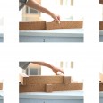
The brickworks was a great engagement for the designers. We have several types in our historical architecture but what if we want to have a modern texture? We had two surfaces that was planned to cover by a brickwork. We decided to delegate one surface to experienced and skilled workers and they made us disappointed. Then we tried different type of brickwork for the other surface and finally find one more appropriate.
Farsi
Please click on the Link below to read the information in Farsi Language.
Click Here!
