Description
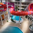
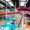
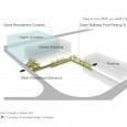
The O’park Project is defined as a set of three independent, yet complementary projects. The first building (building A) houses the main function of a modern and equipped water park. The middle building (building B) includes commercial spaces in the upper floors and functions associated with the water park, such as entrance and ticket boxes, and... on the negative floor of one. The third building (building C) to be built in the future will be an independent water park that will simultaneously provide recreational services for ladies and gentlemen in two distinct but adjacent spaces.
The main ideas for redevelopment and reform of the O’park Recreational project were formed around the creation of spatial openings as well as spaces for interaction, increasing the possibility of understanding the space and position relative to the whole building by the audience, as well as improving the communication of project functions. In a project with this kind of profile, the economic exploitation pressure and the desire to make maximum use of congestion, make it difficult to achieve architectural qualities. To overcome these challenges and to refine the project design, not only changes in structures, plans and programs, but also the reforms eventually led to changes in the project's functional program were necessary.
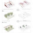
In the first encounter with regard to the level of occupancy of one hundred percent of the project, the absence of empty spaces and green spaces was identified as a major flaw in the project's previous design. For example, the project entrance was immediately followed by steps that led the visitors directly to the ticket office. The only vertical connection between the commercial building floors was through the elevators and escape stairs, and there was no void left for visual communication between the levels. At the same time, the longitudinal division of the 1st floor led to repetitions of functions such as ticket boxes, which were not necessary for the division of men and women.
The new architectural group came to the project when structure, floors and ceilings, as well as part of the park and structure of the middle building (B) were executed on the basis of the previous design. The difficulties associated with changes in the executed sections, created additional constraints for design, but the improvement of the quality of the spaces was not possible, except with significant improvements.
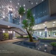
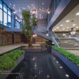
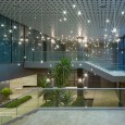
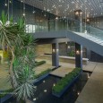
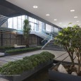
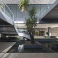
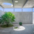
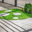
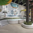
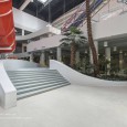
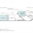
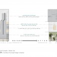
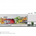
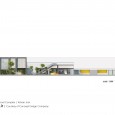
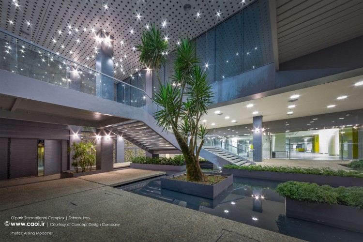
The functional layout of the middle building (B) in the previous situation required that the first floor of the project, which is the main input of the project, would be completely separate from other sections of the building. With the intervention by the architectural group in the project, simultaneously with the combination of some functions such as access routes and ticket boxes for ladies and gentlemen, it was possible to create vacant spaces and to provide a wide range of contacts needed for a public project’s audience. Additionally, with the prediction of a central void on the commercial floors of this building, visual vertical connection between all classes was achieved, which contributes greatly to the spatial quality and synergy of the classes. The most important transformation of the middle building (B) was when, in agreement with the employer, the structure of the input section was corrected and part of the first floor retreated to create a double height void in the main entrance section of the project. In the absence of any previous courtyard or green passage in the design of the previous architecture, this free space was used to create the project's backyard, consisting of green spaces. With the forecast of amenities and facilities, the employer was given the opportunity to exploit this green space.
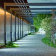
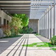
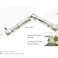
Another challenge for the project was the car access to the main water park. To create access to the water park and to limit the visitor's visibility to the adjacent construction work, a green pass with a semi-transparent wall and a semi-open ceiling was designed. The semi-open ceiling provides the necessary awnings for clients in different seasons, restricts their vision to construction operations, and provides conditions for light exposure to plants.
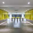
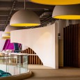
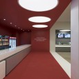
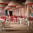
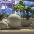
The existence of multiple functions, the extent of spaces such as locker rooms and showers, could make it difficult for visitors to identify their location and also reduce the quality of space. In order to increase the readability of spaces and communications, the minimalist approach based on the use of simple geometric shapes, opening the interior space, and color utilization were adopted in the internal architecture to make the spatial position understandable. All-white balloons were selected in all parts of the park as the main element of the internal architecture. White balloons sometimes are used as railings, which are essential parts of a water park, sometimes turning into hemisphere as a bench or pot, and sometimes large hemispheres play the main lights of the project. The use of color coding in the Locker room, the main areas of the water park and the game's path helped spaces to be understandable and accessible. This minimal approach to interior design has led to a prevention of common theme making which is common in water parks to keep the space free and legible.
In the previous architectural design, for the main space of the water park, with the exception of a few lights on the ceiling, there was no path to direct natural light into the project. By transferring the mechanical facility on the northern front to the western front, a large opening was created on the northern front to bring daylight into the park's complex, while at the same time direct sunlight that could create greenhouse conditions in the park's interior. Considering that the main entrance of the park is from the south, and visitors from the -1 floor enter the main space, their encounter with the northern opening when entering from the bottom into the park area creates a sensation that the indoor effect of the space is dimmed.
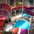
In the design of the park's main space architecture, the area was designed to be completely fluid to fit the excitement of the water park. In the early design of the project, broken surfaces such as rectangles and trapezoids were used to define elements such as pools, end caps and bridges. These elements were even affected by the foundation of the project. The existence of these geometric shapes contrasted with the new design goals and was inappropriate in terms of performance. In swimming pools and ponds, due to the connection to the foundation, there was no possibility of alteration of the form, with the soft lines of the area around broken geometry, the modulation and fluidity of the space was strengthened. In some cases, such as bridges built on the rivers, the previous structure was dismantled and it was replaced with soft curves and lines.
Innovation in material manufacturing is the most important achievement of the architectural group in the project. On one hand, the requirements for observing safety and health at the water park, and the humid environment and chlorine’s constant proximity, on the other hand, had a lot of challenges in selecting the material for the project. To cover the floor of the water park, numerous experiments were carried out to create a mix of natural colored stones and polyurethane materials by the architecture studio and the contractor. The end result of these tests, which did not have any known similar, made it possible for a single-handed full-length and seamless floor without a tiled surface or disconnection with a viscous and touch-sensitive material on the sand beach, during its long lasting quality. In the construction of white balloons, various combinations of composite materials were studied. At the end, materials with high resistance to tension and erosion, hardness and large-format molding were achieved.
Structure
The structure of the park is composed of two parts which are reinforced concrete and metal structures. Part 1: Equipment retainers and access paths for users, made of concrete columns, beams, concrete slabs and all water supplies and pool bowls. Part 2: Metal structure for the final cover of the salon which is approximately 30 meters in height and 85*85 meters in diameter, divided into rows with approximate gates of 35 and 50 meters. Design and construction of the structure is based on the latest National Construction Regulations of Iran.
Mechanical Facilities
The O’park mechanical facilities has an area of over 4,000 square meters, which includes equipment for water treatment, heating and ventilation. Four hot water boilers with heating capacity of 3000000 kilocalories per hour, air heating and hot water supply equipment. In order to optimize water use, the project is equipped with a wastewater treatment and recycling system with a capacity of 150 cubic meters per day for light sewage, 50 cubic meters per day for heavy wastewater and 600 cubic meters per day for water consumption.
