Description
The “BLUE CUBE” is an administrative multifunction project, an office and a showroom for a publication house located in a fifty-year-old building in 7th district, Bahar St, Tehran.
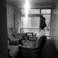
In the beginning, when this project was presented to our studio, according to the initial situation, the entrance level was equal to the alley level, so the unit height was about two meters which was not proper. The second and third parts were 15 cm lower than the main level so the unit height was increased to 2.15 meters. The main problem of this project was the unit height that prevented us from being able to use space properly in most functions and also limited us in floor and ceiling design.
The first process that occupied our mind was to solve the height and entrance problem. The next point was the longitudinal proportions of the project. The project consisted of three main parts and due to the type of linear proportions of the project, this unit was more like a corridor. Because of the lack of proper daylight, vicinity of the unit facade with the alley, high buildings shading over it, and having a surrounded backyard daylight was blocked these added up to a dark unit.
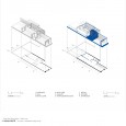
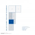
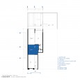
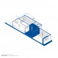
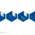
The first decision was to alter the service spaces of the project. Such as the bathroom, toilet, and kitchen. As the client requested a multifunctional space we decided to have an open space plan in order to have a flexible space to respond to the multitude of uses. This project was for a publication house and according to the publication’s activity, space-programming was specified which included a retailing, a free talk space, management office, conference room and service zone.
Due to the coexistence of the two yards of the project and the lower units, we were able to link the yards, which were surrounded by thick walls. The separation between the two yards had blocked the daylight entering the lower level unit. Through a light stair, an attempt was to establish a short connection between the two yards without reducing the daylight for the lower level unit. This has caused to create two yards in different levels.
We started this project with a few questions:
- What is going to take place in this project?
- According to the unspecified program of the project, what functions can be assigned to it?
- What new services can be added to the existing ones of the publication house?
- How can we achieve proper zoning, according to the longitudinal proportions of the project?
- How to reach an appropriate height according to the standard?
- How to have exposed required utility?
With each of these questions, it tended to achieve the best possible solution. As it was mentioned before, the main considerable subject was height. Indubitably it is impossible to design a dropped ceiling in a project with such a short ceiling level (about 2 meters). Inevitably in order to solve project infrastructure problems, usage of constructional techniques, mechanical and electrical utilities were proper solutions. Also, it is possible to design them as exposed elements.
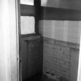
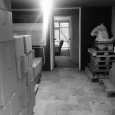
At the beginning of the deconstruction, a barrel vault appeared underneath the ceiling finishing. As this barrel vault expressed one of the main building identities in the first and second Pahlavi periods, it became an important element of our design. Consequently, it was tended to design surface-like intersections in ceiling plan, and throughout this technique, utility pipes were spread inside them, this had led us to a better zoning plan.
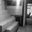
For project height standardization, the first move was to demolish the floor as much as the building foundation could let us. Due to this procedure, ceiling height had increased from 2.00 to 2.40 meters. In addition, two more steps were required for project entrance.
Now that the floor was to be rebuild a lot of electrical utilities could have been placed into it and as a result, a linked dropped ceiling was no longer necessary. The essential requirements were to create a joint space. Among the problems of linear projects is their similarity to long and useless corridors due to their small width. To prevent this resemblance it was tended to create a joint space (a pause space) in the middle of this plan to fracture the longitudinal proportions of it and to give some time to the passengers to ponder.
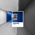
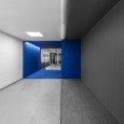
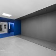
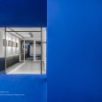
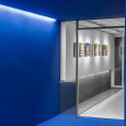
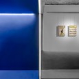
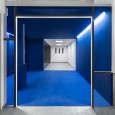
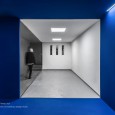
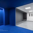
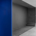
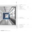
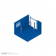
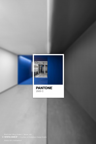
The Projects main idea is based on this box looking space called the “Blue Cube”. The blue color was inspired by the publication logo (Cobalt blue, code: R: 37 G: 64 B: 143).
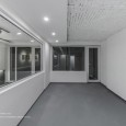
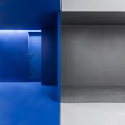
The bigger this pause space could have been, the better it could have functioned. Achieving this proportion, was not possible without destroying the walls of the management room, bathroom, and kitchen of the previous plan. Through this destruction, a column and a drain pipe appeared in the blue cube which used to be hidden inside these walls. In order to be able to rebuild new walls without losing the opening that was made in the space, the most reasonable solution was to keep these elements exposed, to use them as a monument rose the unit itself, to reveal the true identity of the building.
The importance of this decision was not to hide any elements in this project, from structure to utility pipes, unlike how they are commonly placed underneath layers of finishing. To use these two elements located close to each other next to the management room, as a monument, they were fixed for aesthetical reasons and also to prevent any future damages to the drain pipe the lower part of it was designed like a box.
Due to the Lighting Design of the blue cube, marginal lights were used in the depth of the ceiling in order to keep the purity of space because of that other distinct elements have not been installed.
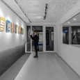
This cube is a specific space for gathering and communication that leads people from the first place to the second place. The main point of the project is this space which is called pausing space and this feature has been used in the architecture of Iran frequently. This space has the main effect on visitors, Previous and next spaces of this cube define its identity. We attempted to create a memorable space by changing the color and the material.
Spatial quality and designing each element and layouts in this part tended to keep the pureness so that space could be seen as a unified whole and create an appealing sequence for visitors who enter the project for the first time, so to make it memorable for them also to create diverse uses like book autograph celebration, movie criticism and presentation of specific products.
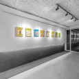
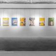
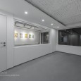
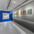
There are two separated parts at the ending zone of the project. The main zone is improvised for both uses such as office and a new function as a gallery. Gallery lighting and wall designing have also been installed for this part of the project. Special details were designed to hang drawings, paintings, maps, and products between the wall and ceiling so to make these elements invisible.
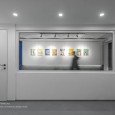
The metal notches were designed on the floor to describe the project’s main proportions that are extended to the backyard in order to visually connect inner and outer spaces. Due to The narrow width of the third zone, it was decided to use the transparent wall between the gallery and management room .Moreover, moveable shades used to separate these two spaces to create a controllable view, also this integrated window helped to widen the space. The last point was changing the restroom wall layouts and its openings in order to create a separate restroom for management and the conference room.
