Description
Men's Club (Unique Salon for Men)
Where gentlemen are themselves.
Our client entered the hairdressing profession in 1998 and since then has worked at eight different salons, accumulating a wealth of expertise to now enter his third decade with a deeper understanding of best practices in the business. It was at this point our firm listened to him to discover a typical salon’s limitations. Additionally, we analyzed the needs of both the employer and clients creating a proposal surpassing the average barbershop. Foremost was the need to have a dedicated space for men to relax and recover from daily work fatigue. This was addressed by our proposal to create a space with services exclusively for men. Another need was to ensure the men's club was located in a unified space and in an upscale neighborhood; therefore, with the agreement of the employer, a hall with an area of 400 square meters was rented in the luxurious commercial area of Mashhad on the fourth floor of a newly built commercial complex.
Firstly, we conducted a detailed survey of the customers' needs and received some tips directly from the staff of the complex. The surveys showed that along with the comfort of the customers, the comfort of the staff of the complex is equally important. Next, we completed the planning tables for the needs which we analyzed to determine the architectural answers for the feasibility, viability, functionality, serviceability in regard to the beauty sector. The financial limitations, the lack of security due to the long-term presence in the new building, and the complex owner's refusal to make fundamental changes to the space directed the design response towards a minimal change in the structure of the space and the design of flexible decors with a reuse policy in the future spaces.
Consideration was also given to ensuring the implementation had easy portability and minimal damage during future assembling; hence the overall structure of the elements was formed by combining wood, metal and glass. The proposal for the areas that were significantly costly in regard to equipment and operations, guided us towards safe use and percentage sale of furniture in the space. Thus, on this basis, the design scenario was directly influenced by the National materials and the reuse of the salon equipment, including equipment such as: hairdressing mirrors, hairdressing heads and trolleys.
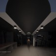
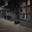
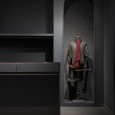
The physical program and the design scenario, according to the functional-service limitations and the user's emphasis on an open and unified space, directed the design team towards creating a communication point between the functional and service areas. This response in turn led to the creation of a special and unique spatial quality namely a men's clothes display which served as an event, and met the employer's need for a direct view of all services when entering the salon.
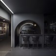
While waiting, the customer can relax on a comfortable piece of furniture in front of an 80-inch screen, play games with other customers, order a favorite drink or watch a TV show. Customers can also enjoy the outside view of the city by ordering from the coffee shop bar in the smoking room. The waiting area is designed so that customers who enter can see all the services of the complex by mirrors strategically placed there. This was done to create a sense of belonging to the place with the aim of revisiting and sharing this feeling with others.
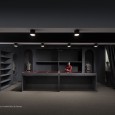
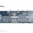
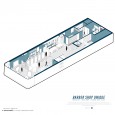
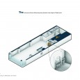
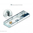
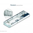
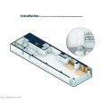
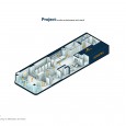
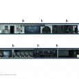
One of the main goals was the intelligent zoning of space. It was planned and designed in such a way for both customers and employees to feel comfortable in the same space, and at the same time, for the highest quality of services to be easily accessible in all six functional-service departments.
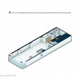
First: Reception in two exclusive areas for the groom upon arrival and the waiting area in the closest place to the communication point of the space.
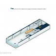
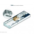
Second: The exclusive sale of men's clothing was placed in the vicinity of the waiting and consulting area, and the sale of men's hygiene products was located in the vicinity of the waiting area and the main hall of the barber shop.
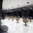
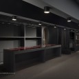
Third: The public and main hall of the barber shop was located next to the sales area and in front of the washing service area and manicure and pedicure services.
Fourth: The groom's makeup was placed in the royal space and the vicinity of the urban landscape with a private entrance to the hall.
Fifth: Massage and cleansing were placed in a separate section on the south side of the hall due to the need for peace and comfort.
Sixth: The management space was located at the entrance and adjacent to the reception area.
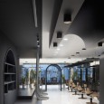
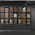
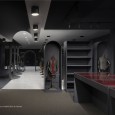
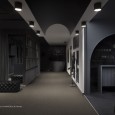
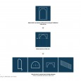
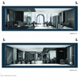
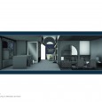
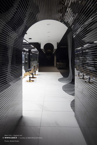
The choice of a familiar form was to engage the audience's mind. This form allows for expansion and repetition of the arch, which has shaped the formal coherence and composition of the space in different dimensions and structures. Indicative forms and influential elements in the space, focusing on golden proportions in its composition, have shaped the viewing angles for the audience in each area without interruptions. Mirror work was introduced in the space allowing for visual communication between different elements and creating a connection between the environments. Furthermore, there was a conscious use of basic numbers of traditional Iranian architecture 3-5-7 in the space.
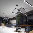
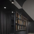
The grey colour was applied to eliminate the natural shadow and it was chosen so that trimmed hair would be less visible. Providing makeup and trimming services to 21 people in the salon at the same time. Special attention to lighting was taken and the lights were placed in such a way to prevent shadows from obscuring the customer’s face while having their hair cut; thus, mitigating any errors a barber could make from this distraction. The separation of the space was done by changing the flooring materials and the ceiling’s colour. Lastly, green space was installed in different parts of the hall.
Key elements of space
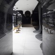
First: 24 frames were installed at the entrance as a sign of 24 years of activity and 8 eyes inspired by the previous 8 work spaces and a single large frame was installed in the waiting area as a sign of the client entering a new era of his career.
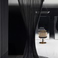
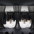
Second: The use of hand-woven curtains made of soft galvanised metal wire, a metaphor for eastern men's battle armour and wedding dress lace, as well as men's long hair in the past.
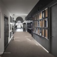
Third: SABAT's signature element at the entrance of the special part of the collection with a mirror made of Chinese clay in dimensions of 3 cm and 210 cm long, is a metaphor of the old corridors of past architecture.
Fourth: Seven arches separating the hairdressing salon space from the prominent space and the palace with the metaphor of the five doors of the palace of the past architecture. and creating semi-transparent spaces in Iranian architecture.
Fifth: The crown of the hanging arch in the communication path of the service spaces serves as a metaphor of the transition of past and progressive and future architecture.
Sixth: Waiting room windows reflect the commercial space in the living room, a metaphor for reflecting and expanding the audience's vision.
