Description
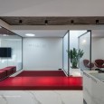
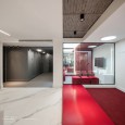
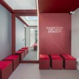
At first, the expression of this name creates a feeling of duality. Haco+tech is a combination of the names: Hacoupian and technology. This space is the information technology unit of the old and well-known clothing brand “Hacoupian”. The new generation of this collection defined the project. This building was a space for growth and communication between the old and new generations of this business. The project’s building was a 60-year-old apartment with masonry materials, old and authentic like the brand itself. This was the basis for the formation of a dual approach to the project. Creating solidarity and building a single core from this duality was the main concept of the project.
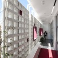
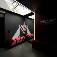
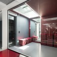
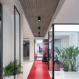
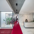
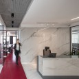
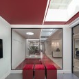
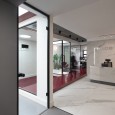
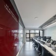
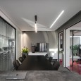
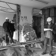
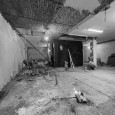
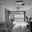
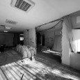
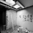
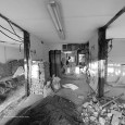
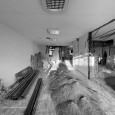
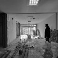
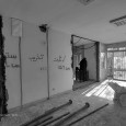
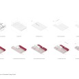
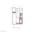
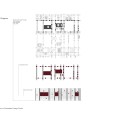
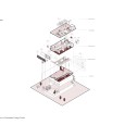
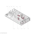
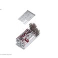
From a technical point of view, it was not possible to create a space with high transparency and an extensive layout in a building made of masonry materials with a room-in-room existing situation. For this reason, we looked for the design and implementation of a complementary metal structure to strengthen the structure and create spatial openings. In the valuable parts of the project, we preserved the old elements, such as the composition of the vaults, which were more impressive with restoration and painting, and they were placed next to the flat panels of Knaf with linear lights, which will express the relationship between these two generations.
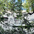
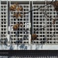
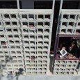
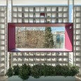
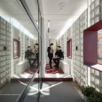
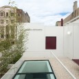
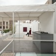
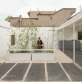
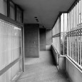
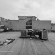
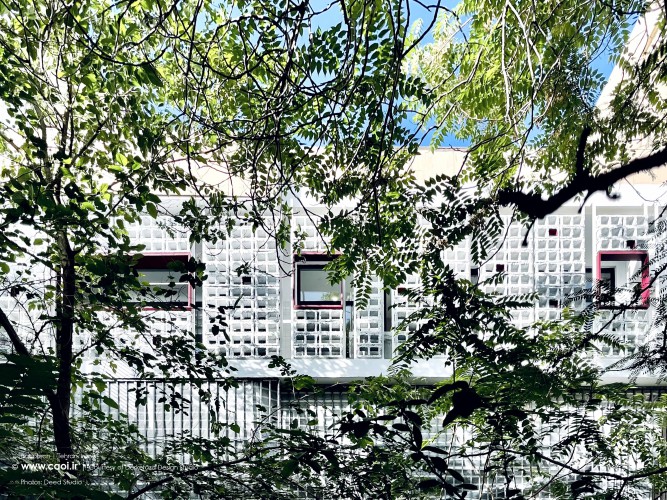
In the south elevation of the original building, there was a cement latticed wall that made the outdoor staircase to be visible and invisible from different angles and points of view. Adding some modernity to this concept, we built a shell wall on the terrace wall of the north elevation. This multifunctional wall is made of cement blocks which provides a semi-open space quality, also it controls the amount of southern light. This shell makes the terrace space belong to the people who work inside the workstation of our project and preserves the privacy of the people from the surrounding residences.
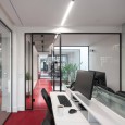
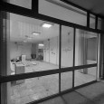
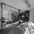
The second part of this structure is a suspended platform that transfers the mass of the shell to the beam in the facade and the edge of the roof. These parts were designed and set to create three different points of view for the users. The third part of the metal cables, which are tables for drinking coffee towards the courtyard of the building, and at the same time, they have the function of connecting the cement wall and its metal grid. In this project, we saw windows and frames in a different way. Window frames are not necessarily unattractive. They can frame the spaces for us like the two-dimensional linear compositions of Mondrian's paintings.
Farsi
Please click on the Link below to read the information in Farsi Language.
Click Here!
