Description
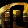
This project is located in Tehran which is the most crowded city of Iran. The cultural and social condition of Iran is in a way that the coffee shops are the most popular places for young population to hang out. And if they feel comfortable in a specific one, they always know it as their own hang out place. This project is with the dimension of 10.5 by 5 m (52 sqm) and located in the second floor of a two-floor shopping mall. The concern of the client in the first place was to have a space with unique design qualities with a low budget. In this project our aims were to introduce new ideas, at the same time create a unified space with different spatial qualities in a limited space. In this project we were not just trying to put the materials and form together, but also we tried to create a design that can describe an independent identity and new vision about the interior elements for this coffee shop.
Our design concerns
1) considering the size of the space which was 52 sqm with the height of the 4.5 m, we were faced with the challenge of reducing the sounds generated by conversations of about 42 people as much as we could(by redirecting the sounds).
2) our next concern was to reach to a solution which was able to create multiple perspective views in every single spot of the coffee shop. As people are walking through or using the different zones of the area, they could observe dissimilar perspective views in each zone
3) Another concern was how to create homogeneous space from one unified source
4) Finally it was to simplify the construction method due to construction abilities and technologies in Iran and simultaneously reduce the cost of material and construction technologies.
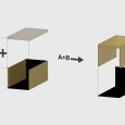
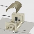
The project functionally is divided in to two main zones of kitchen area and the main hall, but in the concept phase we considered them as four zones of entrance, the main hall, the serving counter and the kitchen. Due to that the cubic box was divided to two main parts:
A: south-north walls and the ceiling
B: east-west walls, the entrance and the end walls and the floor
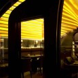
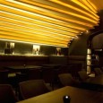
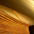
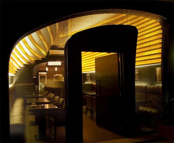
In part A based on our concern we tried to unify the walls and ceiling and also the lighting elements. As this part was the main hall, we tried to use an innovative method for indirect lighting to merge it with the design elements in a way that the lighting is not an independent element. The method of creating this solid mass is based on morphing two curves over each other. This method creates variety of different perspective views and tends to produce diverse experiences in each spot.
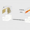
In the next level, for a simpler construction and better absorbing of sound we divided the morph in to horizontal cross sections. Lighting elements that are LED fibers are placed between the sections. By this method we provided the main light of the area in an indirect manner. This fact conveys a relaxing form of light in the space and also eliminates any sharp and disturbing type of light. To decrease the costs, the curves in different cross sections were printed in real scale and the forms consist of aluminum structural supports covered with plaster panels. The final cover is acrylic colored plaster panels. The execution cost of the ceiling with the lighting summed up to 6000 $ which is very low comparing to other methods of construction.
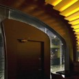
In part B the material is limited to dark wood that connects the entrance wall, the floor, the serving counter and the kitchen.
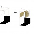
The shape of the entrance and counter wall was effected by two generator curves in part A. Part B completes the part A in a way that these two parts are the pieces of puzzles put together and complete the cube of space.To avoid multiplicity of materials, the idea of the project in material selection was to allow two basic materials to conduct their role effectively.
In part A it is limited to basic white coat that covers the roof and the walls continuously and in part B it is the dark wood color and the furniture’s made by dark wood colors and dark brown leather. The reasoning behind choosing the dark color of wood was to eliminate the diversity of texture and existing colors in the wood itself, in an attempt to provoke the spatial quality and flow of light in the space.
Farsi
Please click on the Link below to read the information in Farsi Language.
Click Here!
