Description
“Simplicity of shape does not necessarily equate with simplicity of experience. Unitary forms do not reduce relationships. They order them. If the predominant, hieratic nature of the unitary form functions as constant, all those particularizing relations of scale, proportion, etc., are not thereby canceled. Rather they are bound more cohesively and indivisibly together.”
Robert Morris
Art Forum, New York: Vol 4, No 6, Feb 1966
“Designing the Mina Residential Project includes a set of architectural solutions in order to create a spatial added value for the known types of residential apartments that the vertical connection in them has been dissolved as their core. The colors and materials, executive details, and the spatial organization of the project has been wisely selected and has shown the possibility of a different experience of the interior spaces of a residential building and its public spaces.”
The Jury of The First Biennial Competition of Architecture & Interior Architecture of Iran
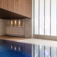
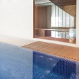
The present building, the result of Mina Residential Building design, is situated on a 580 sqm lot in Niavaran, Tehran, with a floor area of 2420 sqm, with five residential units, two floors for public facilities and amenities including the lobby, parkings, pool, installation, guard room, and the stores.
The site being located in a deadend full of old villas was one of the most important factors in creating the basic idea of the project. The project was the first house being reconstructed in the area; the responsibility of drawing the first line on a blank paper.The idea was finding a pattern that could both make the next designers of the adjacent buildings which would be renovated sooner or later free and also create a uniform contemporary visage.
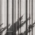
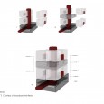
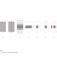
A Barcode became the idea of harmonious combination; that every reconstructed house become perceived as the constituent lines of a barcode, despite having a distinctive feature compared to other components; a pattern creating a harmonious and coherent space instead of a boring and crowded pass way. We draw two lines as the first fraction of this whole.A design formed from a cube-like volume comprised of two general sections with distinct features but harmonic and symmetric. And this duplex idea was continued in organizing the plan spaces.
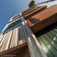
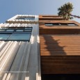
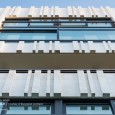
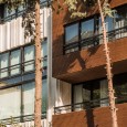
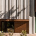
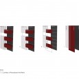
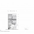
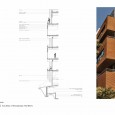
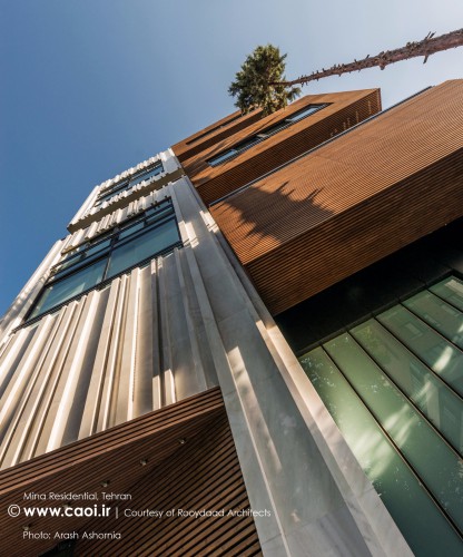
The innovation of the front view and the handmade designing, new application of common building materials, are as the stone of the building. The design of the front view, against the pressure of economic efficiency and the hundred percent construction of the constructing surface, created a potential of making a one and a half meters depth and the connection between the surface and depth and their contrast. For this reason, a three layer mass and the general visage made the two adjacent parts which replaced the blank space in the urban body. In this way, the building gained a good dynamism with the two-part and multi-layered front view.
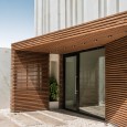
The deep wall: The right part of the façade was converted to a collection of multiplying boxes, like the Donald Judd cubes, where the surface of the boxes serving as a terrace, created the residential façade, defining and identifying the negative space. The ordered wall: The left part of the linear geometry was created for visual order and the white color is chosen to reduce the visual weight and pressure. The thin wall: The thin crust as the base and main ground of the design, containing both parts, was defined with a dark color to intensify the depth.
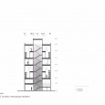
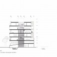
At first the building was planned to be built up to a height of four residential stories. For this reason, for an efficient use of light and view, the units were designed as northern-southern duplexes. By acquiring the building permit for the fifth flour, the problem of adding another residential floor and its compliance with the building was a new challenge.The added floor was designed as a flat unit, between the two duplex stories. Its external southern wall bore a retreat and a terrace to reinforce the front view of the building.
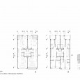
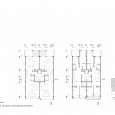
1) The division of the façade into two parts was continued in the plans. We split the land in to two on the north-south axis, so that all units can enjoy the light and use of façade on both fronts.
2) The light and its accessibility, due regard to the 25 meters depth, according to the regulations of the construction range of sixty percent plus two, was the most important challenge in organizing the plan.
3) Placing the communication and service mass at the center and keeping the distance from light frontiers made the two lightwell walls free to provide the required surfaces.
4) Taking the distance from the adjacent walls and being placed at the center of the project, connects the two parts of the plan together.
5) For the maximum use of the northern light frontier, independent lightwells were designed by cutting the plan and volume.
6) The connecting space should both create suspension and make connections. Therefore, the vertical connection of each unit was placed at the same service-communicating mass in order to separate the public and private spaces of the plan; in a way that this space becomes both as the pause space entry and also a joint for the horizontal and vertical connection.
7) The relations in the plans are defined open, which are formed along one another and the transparency of the relations were created so that the design does not induce space constraints.
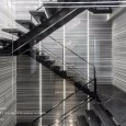
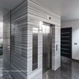
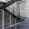
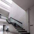
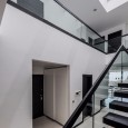
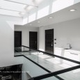
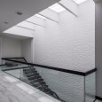
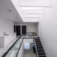
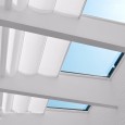
As for situating the staircase and the elevator at the center of the plan, the quality of the convenience area before the elevator were of great importance. For this reason, for the vertical connection between the floors, a metal exposed staircase, with stone treads, was placed resembling a minimal metal statue, on a setting consisting of horizontal lines of the texture of natural stones, to induce depth and perspective, accompanied with natural lightning from the ceiling and also a vertical integrated artificial lightning. A whole glass wall has separated this minimal statue from the lobby for a better visual contact, meanwhile framing it.
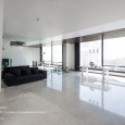
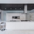
The interiors were kept plain and simple, to maintain its beauty over the years. The panting and materials were selected in a way to create a neutral white sheet for anyone to decorate it according to one’s taste. Despite the simplicity, this pure volume signifies executive details.
