Description
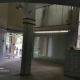
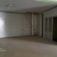
Interior design and reconstruction of “MAHER” women’s apparel (clothes – dresses) store, which is a part of a fine 40 years old building. MAHER store has been in Hamedan for more than 60 years.
- Locality (Location in city)
This building is located next to the circle, which houses the mausoleum of late BOO ALI SINA a well-known doctor and philosopher. This location is a tourist attraction. City dwellers and tourists are wondering around in the area for shopping or otherwise. This point has been a main source for the design idea.
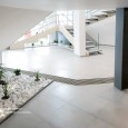
Design has been formulated in such a way in which store’s internal space is a continuation of city’s space and impact of the city is felt in the store. In fact, if the commercial application of the store is removed, still it could be a proper space for people to wondering around the city and could be taken as a part of city. The experience and memory of a space whether commercial or otherwise motivates people to go back to space, for shopping or entertainment.
- Huge staircase, aligned with city
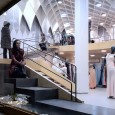
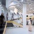
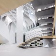
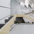
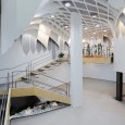
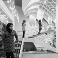
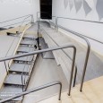
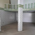
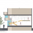
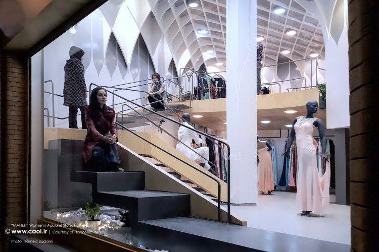
There was a balcony inside the building, which was demolished during the reconstruction, due to structural problems. This created a space with 5.5 meters height. We placed the staircase in this space as an independent object. This object (staircase) is independent, with 50 cm distance from the walls of the main building. The staircase has created diverse spaces with various applications within 5.5 meters height. People could walk through the stairs, which goes through store’s glass showcase, stop at landings of it and look around. They could also stop at the last landing, which is a kind of a balcony.
- Showcase, a place for people to go through, not mannequins
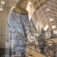
Usually, mannequins placed in the showcase to attract people, and customers to the store. However, in MAHER store, mannequins are not placed in a showcase and instead people see some walkers who go through, stop or even sit in the showcase. People from outside watch those inside and those inside watch them outside. In a way, mannequins and people have taken each other place.
In MAHER store, people who go through staircase in the showcase are visible and attracting people from outside not the dressed mannequins. This feature gives a distinctive position to the MAHER store, as mannequins have scattered throughout store. In this design project, a social topic is addressed and a social expression, evaluation and interpretation of mannequin-ism are done via architectural space.
- Inner space skin (membrane)
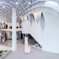
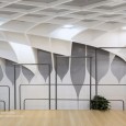
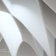
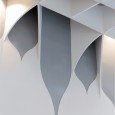
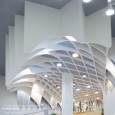
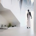
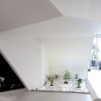
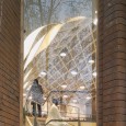
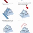
An independent inner space skin, coordinated with old building’s walls is created in the main space of the building with 5.5 meters height. This is an integral membrane, which covers floor, walls and ceiling and its form and texture are integrated with Persians patterns in a nostalgic way.
In relation to the organizing volume of huge staircase, diversified and attractive spaces are created (in every turn 0f 360 it happens frequently). Depths, shades and repetitions in the texture, creates a particular space which promotes the space potential and people desire for shopping and converts it to a desirable space for wondering around and entertainment.
- Supports and services allocations
Fitting room is located at the top of the huge staircase, on a last landing as an attached box with a triangle base. Services and storage spaces are separately located on the store’s ground floor.
- Handrails and regales, an integrated and continuous structure
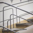
Staircase’s handrails and landings end up to regales and dress hanging location, which make an independent, continuous and integrated structure, while each as an separate object has its own structure and configuration. Either at the top or on the ground floor, all of them are integrated and continuous pipes, which are running at 50 cm distance from the staircase and main membrane.
We did not try to hide that column and we approached it as an added element in general space design and in contrast with...ceiling. In addition, it was a major factor for laying out elements in internal zoning, circulation and directions.
Ceiling: compressed foam with polymer cement coating + Acrylic paint
Walls: MDF + Acrylic paint
Floor: Ceramic Tiles
Huge Stairs: Metal + Wood
Handrails and regales: Metal pipes + baked paint
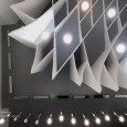
Light frames inside the ceiling cavity: Handmade and metallic
- Significant features of “MAHER” women’s apparel store architectural design
- Considering architecture as a research
- Reducing the building elements to essentials
- Attention to internal space
- Space formation in a voluminous and three-dimensional way
- Relating and connecting of main items of space through contrast
- Ability to create attraction to structure application as a fundamental subject
- Design and attention to all building elements
- Transforming of small, closed, and confined initial space to a vast open space, which happened by identification and utilization of unused, lost and potential existing spaces.
- A different look at the stairs (except the common perception) as a special place next to the showcase for seating, standing, watching, and as a balcony (the largest landing of staircase), this also works as a screen showing people or even a media that is screening the presence of people , inside to the outside.
- Redefining the’ showcase ‘in the women’s apparel store, which is a place for well-built body and static mannequins to a location for movement and presenting of non-mannequin people, with any appearance and look, which has an attraction for pedestrians in a city environment.
- Optimal usage of white and gray colors and wood as a neutral background as an appropriate context for colorful apparel.
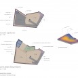
- Separation of spaces without using dividers (except services boxes)in which only structure and form of main elements create this separation and or the connection between the membrane and huge staircase and also the space between the membrane and the building’s main wall leads to separation of spaces.
